With a relaunch event in the diary, we kicked things off with a complete brand refresh. As architects, the AD team wanted to be hands-on, and we built a productive partnership from day one.
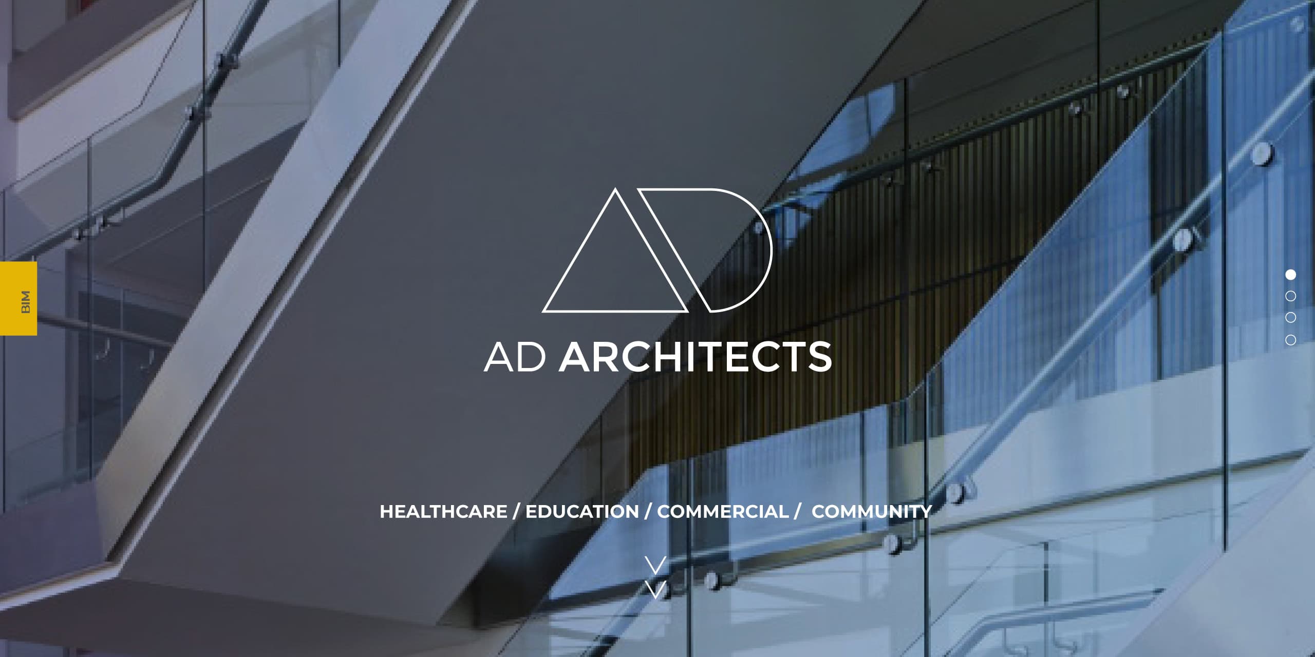
We created a bold, precise logo built from clean lines that mirror AD’s architectural style. By exploring the relationship between the ‘A’ and the ‘D’, we developed a modern, minimalist mark that works effortlessly across every application.
Keeping the existing palette, we deepened the yellow so it holds its own in print. For typography, we chose Montserrat — clean, confident and easy to deploy consistently across digital and print.
To lock everything in, we delivered brand guidelines to support consistent rollout and build long-term recognition.