Architecture website design for LOM Architecture & Design

Modular, responsive architecture website design — built to put people and projects front and centre

Client: LOM Architecture & Design

Completed: Dec 2017

Industrial office bar area with concrete column, pendant lighting and tall stools
Yellow news and awards tile reading “LOM shortlisted for Design Practice of the Year”
People working in studio lounge with tiered seating overlayed by a yellow LOM logo
Tablet showing the LOM website homepage hero banner and intro copy
OM website homepage screenshot with modular grid of projects and news tiles
Open-plan workspace with “Boldly go.” graphic on a glass partition and long bench tables

Insight

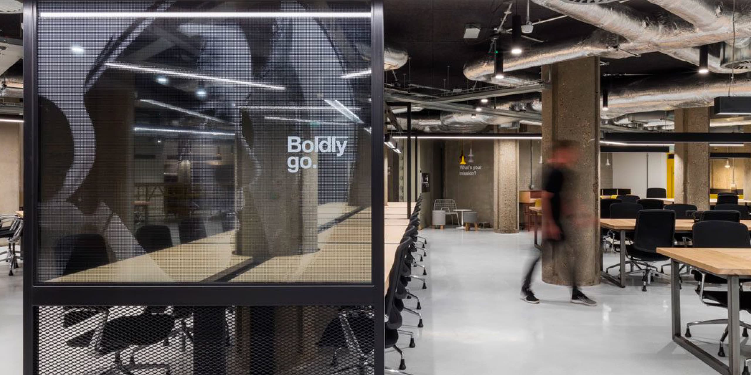
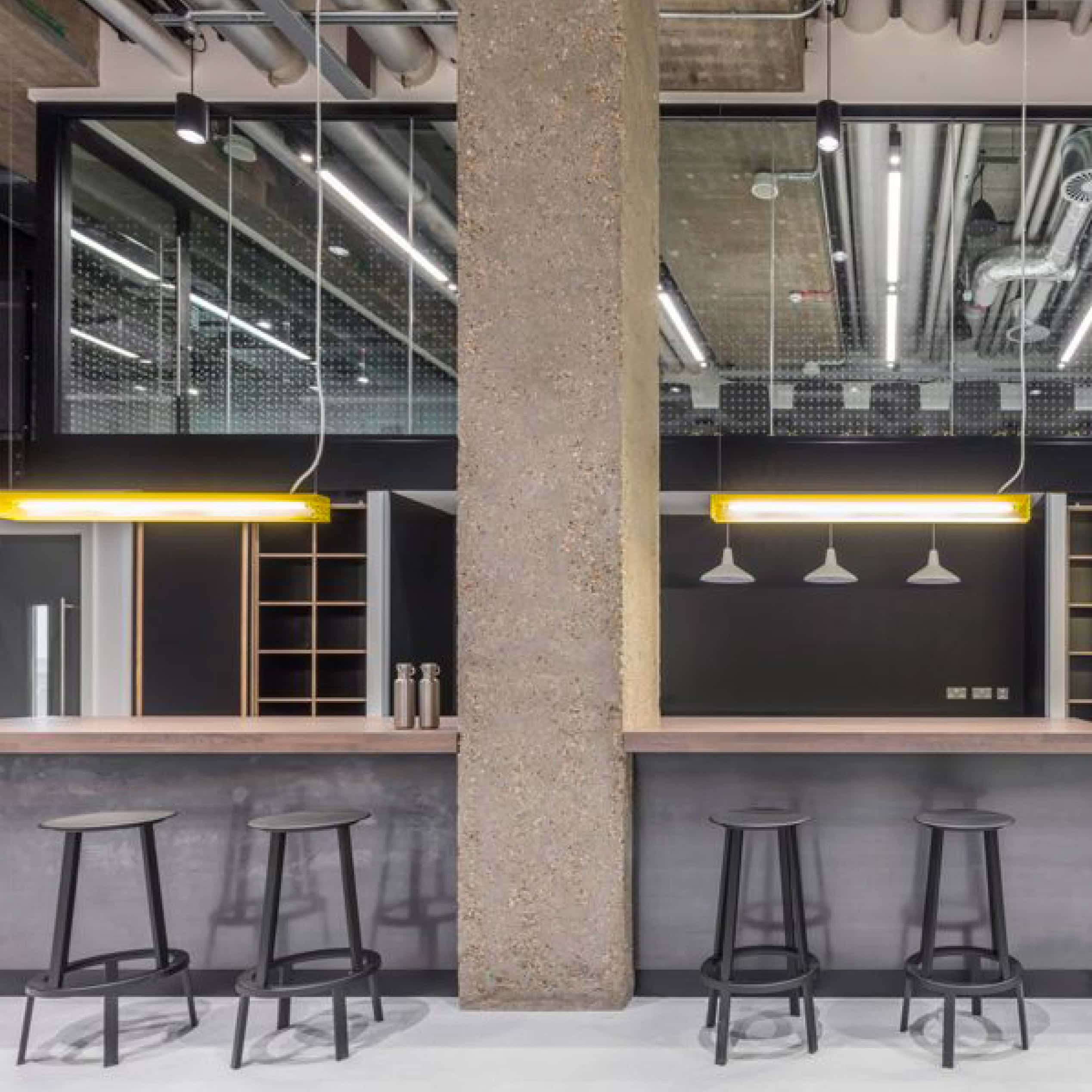
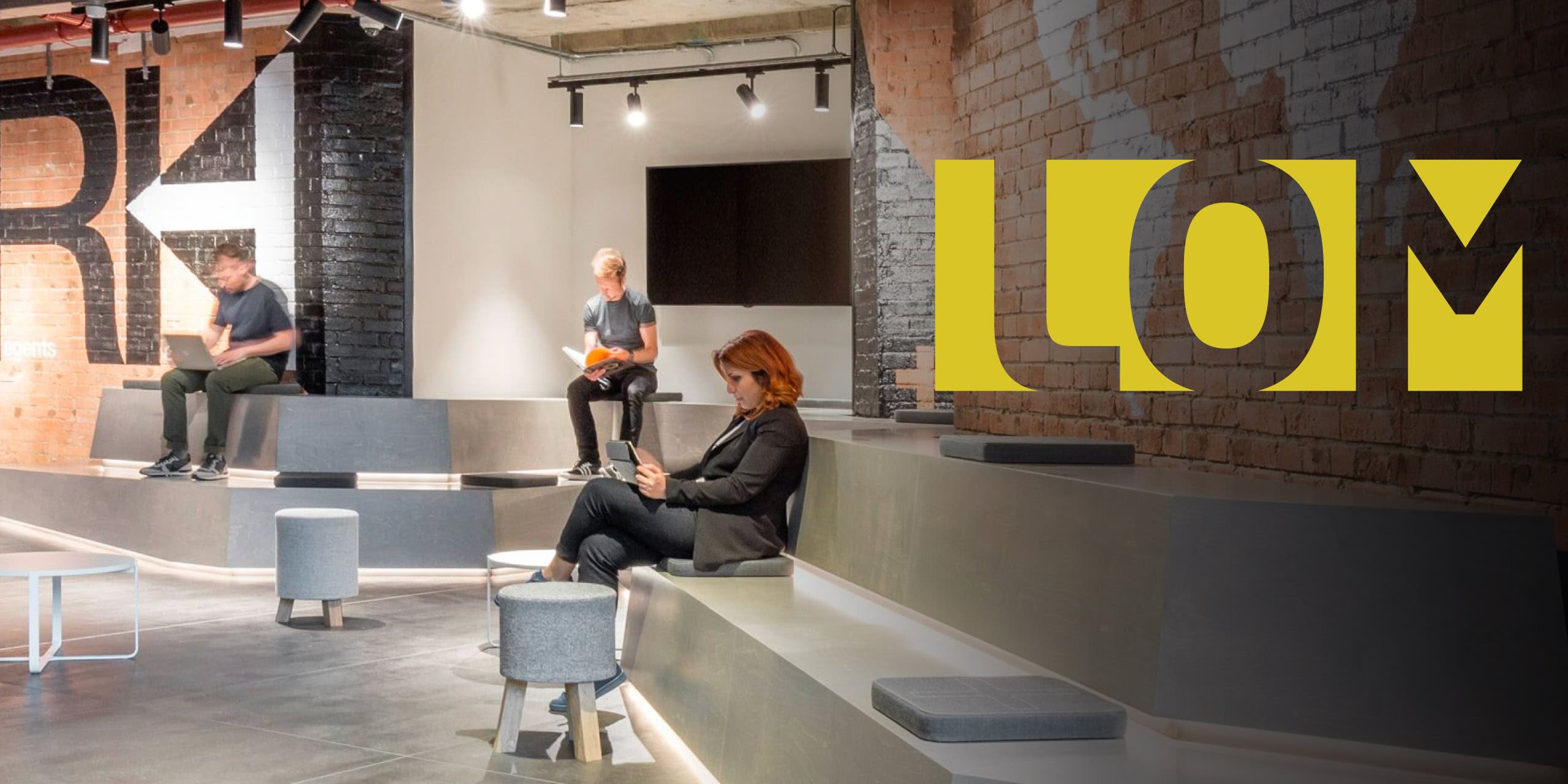
LOM is a London-based architecture and interior design practice with a portfolio that’s as varied as it is refined. But their existing site wasn’t doing justice to the depth of their work — or making it easy for users to quickly understand who they are, what they do, and where to go next.

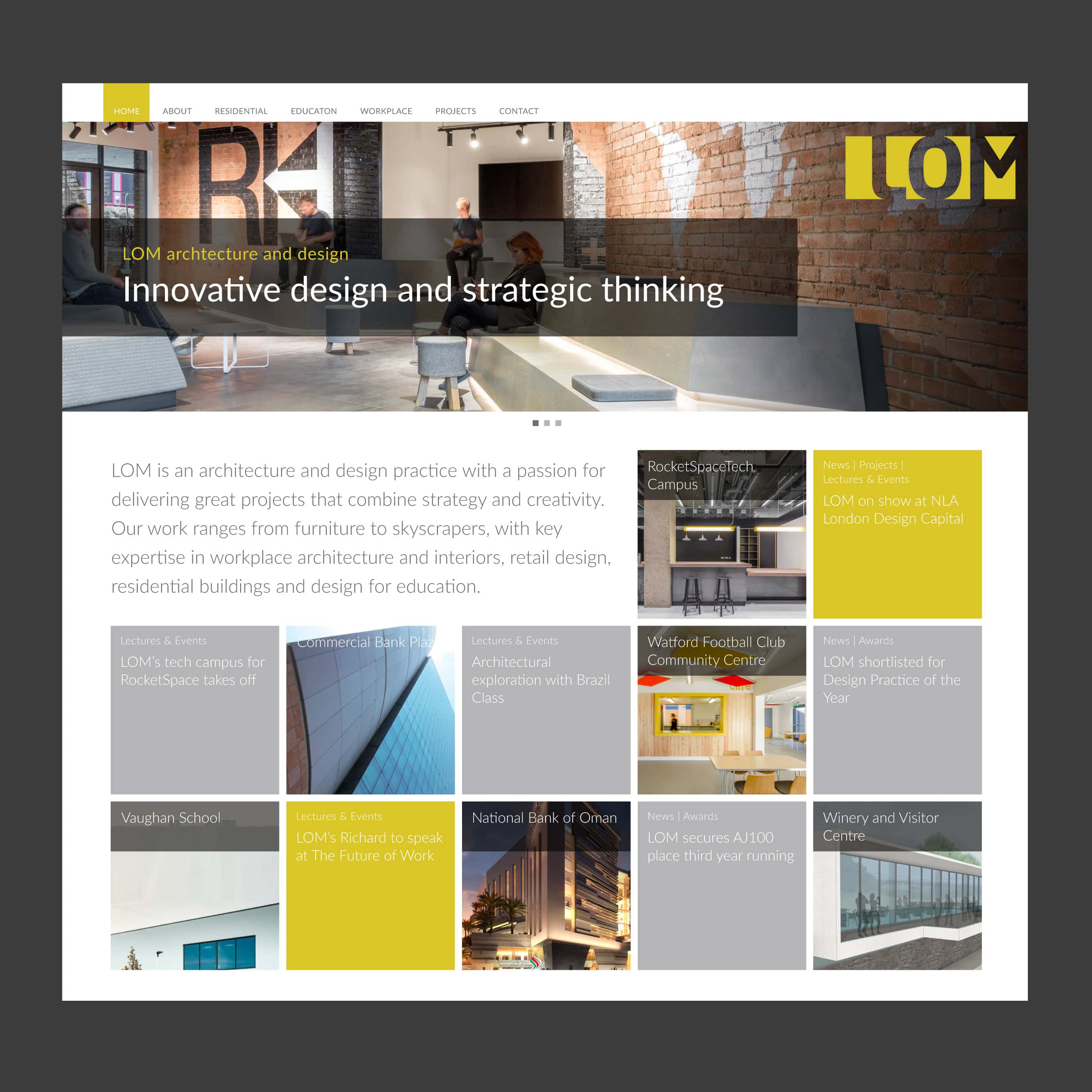
They wanted to shift the emphasis towards two things: showcasing projects in a more impactful way, and highlighting the people behind the practice. At the same time, key information needed to be more accessible — not buried in navigation or lost behind over-designed pages. The aim was clear: an architecture website design that feels calm, confident and highly usable, while giving the team the freedom to keep content current as the studio evolves.

The outcome is a responsive, modular site that functions like a flexible framework — allowing LOM to spotlight the right work at the right time, and create a clearer path for prospective clients, collaborators and future talent.

Web design

The homepage was the most important touchpoint. It needed to deliver an immediate sense of LOM — their ethos, their range of sectors, and the character of the studio — all in a few scrolls. We designed the page to act as a high-impact overview, with clear routes into projects, news, and events, so users can self-navigate based on what they’re looking for.

A modular layout system sits at the heart of the design. This gives LOM control over the order and prominence of content, so the homepage can evolve without redesign work — ideal for practices that need to rotate featured projects, announce studio updates, or promote upcoming talks and awards. It’s a practical approach to architecture website design, where the structure supports changing content rather than limiting it.

Bold hero imagery provides the opening statement — a confident canvas for LOM’s work. From there, the page becomes more structured: a clear hierarchy of information that reflects real user needs, from “show me the projects” to “tell me about the practice” to “what’s new?”. The design avoids visual clutter. Typography and graphic elements are intentionally muted, giving project photography space to breathe and ensuring the work remains the focal point.

The palette follows LOM’s brand colours of yellow and grey, used with restraint to add energy and recognition without overpowering the imagery. Subtle graphic details help create rhythm across sections, while consistent spacing and alignment keep everything feeling crisp and editorial.

We also brought the studio’s personality into the experience through staff and office photography by Mike Goldwater. These images appear throughout the site to add warmth and authenticity — reminding users that behind every building and interior is a team with a shared approach and culture.

Web development

The site was built in WordPress and the CMS was customised around LOM’s long-term content needs. The goal wasn’t just to launch a good-looking website — it was to create an architecture website design that LOM can manage and evolve internally, without relying on developers for everyday updates.

Modular page building allows the team to add new content blocks, reorder layouts, and refresh key pages quickly. Features were designed to be editable in seconds — such as the Google Map on the homepage, where LOM can update project locations as their portfolio grows.

Responsiveness was baked into the build from the start. The modular system adapts smoothly across devices, ensuring the hierarchy remains clear on mobile and tablet — where many users browse architecture sites for quick inspiration or to check credentials on the go.

Performance was also treated as a key part of UX. To keep the site fast and smooth, we optimised image delivery by serving different image sizes depending on screen resolution, and reduced HTTP requests through sprite sheets. The result is a site that loads quickly, feels polished, and supports image-heavy content without slowing down.

Support and maintenance

To ensure LOM felt confident managing the site, we provided detailed WordPress training tailored to their team — including how to update projects, edit the homepage modules, and maintain consistency in layout and presentation.

We also remain on hand for ongoing support as the practice evolves — whether that means adding new modules, refining page structure, improving performance, or adapting the website as new work and content needs emerge. A good architecture website design should never feel fixed — it should be built to grow with the studio.

Rosie Groves // Website Manager (LOM)


Union 10 Design is a great company to work with. Friendly, knowledgeable and reliable. I would not hesitate to recommend them to other businesses looking for website design services.

View all reviews

Written by Jane Comar + Reviewed by James Hofton

Last updated: January 14, 2026

Get in touch


Talk to us about your next project. We’d love to hear from you.